Much has been made recently about the expanding prominence of ‘flat’ design - that is, design which doesn’t rely on mimicking a real-life material or interface method in order to give feedback to the user. But what exactly is it, what are the benefits and negatives, and how has it become one of Google’s most searched-for terms in the last few weeks?
Flat Design, Skeuomorphism and iOS7
Thursday, 27th June, 2013
Flat Design, Skeuomorphism and iOS7
Much has been made recently about the expanding prominence of ‘flat’ design - that is, design which doesn’t rely on mimicking a real-life material or interface method in order to give feedback to the user. But what exactly is it, what are the benefits and negatives, and how has it become one of Google’s most searched-for terms in the last few weeks?
At it’s heart, going ‘flat’ is a conscious design decision to create an interface - be it a website, app, anything - that doesn’t reference a material or method of input that you would find in real life. The opposite would be the awkwardly-dubbed ‘skeuomorphism’, where the digital interface is a mimic of an object or material you would find.
As an example, take the cakendar application on Apple’s iPad and OS X operating system. It specifically references the traditional paper desk planners of old with ‘high-quality’ leather stitching and torn pages at the edge. These materials - paper and leather - obviously don’t exist in the digital world and it won’t feel any difference on a touch-screen, but Apple have made the decision to reference them in order to make the app more familiar with users
This metaphor is taken even further with the animations; clicking or tapping through to the next month causes the page to curl up and tear away from the top of the screen, as if it was being pulled by an invisible hand. Certainly a slick effect when combined with a touch-screen.
Flat design, by comparison, eschews these metaphors and instead relies on shapes, iconography, text and colour to create the interface. Textures and graphical effects are almost non-existent . The notes and to-do list app Clear is a good example; the interface being composed of text titles, colours to establish priority, and.. that’s about it. Buttons are replaced by different finger motions on the touch-screen, embracing the capabilities of the device.
Compare this to the default Apple ‘Reminders’ app, which references the traditional Filofax notebooks with the lined paper background. Both apps perform the same duty but both have taken a drastically different approach for their interface.
Apple’s recent announcement for their latest mobile operating system release, iOS 7, has again thrown flat design into the limelight. Reflecting a change in direction - as well as the promotion of industrial designer Jony Ive to Senior Vice President of Design - the new release drops much of the aforementioned leather, torn paper and other skeuo-flourish in favor of large, thin typography and brighter, subtler gradients. This change of heart appears to be as much to do with internal wranglings at Apple as it is with following trends.
The reaction to their announcement has been mixed; whilst mainstream outputs like the BBC have kept their tone fairly even and aimed at the layman, others have gone straight to the heart of the matter, lambasting Apple for their perceived missteps and lack of design consideration. Some have even gone so far as to redesign the mobile operating system themselves, taking matters into their own hands with some interesting results. The criticism has, ironically, come full circle - critics now critiquing the critics for their critiques.
Whilst such commentary is always inevitable in the online community (especially one as pernickety as designers) it does throw up an interesting debate as the benefits and negatives of both skeuomorphism and flat design.
- Skeuomorphism can create an interface that people are instantly understand, as they have mostly likely used it already in real life. Address books, calendars, notepads all physical objects whose appearance and use are often carried across into the digital world with great success.
- Similarly, a skeuomorphic interface can feel familiar, welcoming and immediately usable. For example: if you’re a new app launching in the great void of the Apple App Store then creating one that a user feels comfortable with and will want to come back to can help you get through those first few shaky weeks.
- Conversely, some have argued that skeuomorphism’s referencing of the real world is no longer necessary as most people - or at least those who use computers and mobile devices daily - are familiar with them and do not need their hand holding in such a way. “Skeuomorphism is a solution to a problem iOS no longer has”, argues Fast Company Design. Instead, data and content should be prioritised over design and flourish.
- Flat design - such as those seen in Microsoft’s Windows Phone and Xbox interfaces - takes a step towards embracing the idea that digital designs shouldn’t be restricted by those of the past, that they should break out of these limitations and utilise the freedom that these new technologies and the essentially limitless palette that is on offer. Simple and exclusively-digital interactions like “pull down from the top of an mobile app screen to refresh it” or “pinch to zoom on a photo” are examples of these starting to take off.
For all the negative critiquing Apple’s new mobile operating system has received for it’s abrupt change to almost exclusively flat design, there are still elements of the influence of real-life interfaces and materials that remain. Features such as the Control Centre essentially sit on a background that mimics frosted glass. The much-touted ‘3D’ home screen where the movement of the phone and it’s built-in gyroscope combine to create a sense of depth and mimic the icons sitting ‘above’ the background. Both are materials and actions that originate in real life and are being replicated on-screen.
Whilst companies such as Apple are often impervious to criticism, the arguments levelled at both skeuomorphism and flat-style design form part of a larger shift towards more innovative and unique interfaces that could only be achieved on a screen. In my opinion this diversity and willingness to experiment can only be seen as a good thing.
Pete’s thoughts
I’ve long been a fan of skeuomorphic design, and see it as an art style that has an appropriate place in some projects. I like the idea of representing real world objects and textures in a digital environment. This opens up creative opportunities to play around with different, unexpected ways of interaction and behaviour, whilst retaining familiar visual clues.
For me, the current Flat Design trend has a minimal, focussed feel to it, and is typically achieved by removing unnecessary aesthetic frills to produce a design that is very much about making content accessible and readable, and meant to be about making interfaces more usable and intuitive. This should be a great move, as long as we retain some character and cheekiness in finished designs, possibly through accompanying illustration work to compliment content, and interaction design through gestures and quick, slick interface animations.
Some of the issues I’ve found working with Windows 8 metro interface on Windows phones, and iOS7 beta on iPhone is that the flat design is (surprisingly) harder to use, as I have become so used to being held by the hand when navigating around skeuomorphic interfaces such as iOS 6. So in both instances, the experience using a flat interface has frustratingly slowed down my workflow. I do like the more modern, streamlined aesthetic that Flat Design has by its’ very nature, but I’m still not quite sold on it as a user.
Craig’s thoughts
Skeuomorphism has been with the human race for a very long time - in fact, it’s been around since at least the 19th Century. By our very nature, humans find comfort in the familiar and certain skeuomorphs were created in the early days of desktop computing aimed at helping people new to the concept of using a PC get to grips with how it all worked.
We’ve all seen the ‘save icon’ - surely this must hold a fairly high position in the most frequently seen skeuomorphs currently in use on desktop machines, but how many people under the age of 20 have actually used a floppy disk? This particular skeuomorph has been around for so long now that it’s representing a method of saving that has long since been relegated to the history books - why then are we still using this particular skeuomorph (comfort in the familiar).
I believe the recent news that Apple has decided to shift away from skeuomorphism is great, but lets all take a moment and remember who did it first. Windows 8 was released largely skeuomorph free and was a better product for it. I think the reduction in skeuomorphism in iOS will ultimately make it feel less tacky.
Emmanuel’s thoughts
Skeuo vs Flat is such a hot (and somewhat tiresome) topic at the moment. While I typically tend to lean towards a cleaner, more minimalistic design style, especially when it comes to user interfaces, I do have a soft spot for skeuomorphic design. That is to say, I’m a fan when it is done well.
For example, I have long felt that Apple has a solid understanding of how to deliver great skeuomorphic design in their products, and I’m somewhat disappointed that iOS 7 is such a huge departure from that. I don’t miss the overuse of texture and tackiness of certain apps (looking at you iCal), but I do find the simplification of some of the user interface elements (buttons, etc) and icons a little jarring. Furthermore, the whole experience is such a dramatic change from what I’m used to from Apple that I wonder if they are losing their identity.
Skeuomorphic design serves perfectly to create familiarity. I don’t think we should kick it to the curb just yet simply because flat is the in thing. It’s easy to forget that they can work together, they are not opposing forces, you can have skeuomorphs in a “flat” design.
5 Dangers of Flat Design by @uxpin http://t.co/naERc0vFiP. Thoughts? Do you agree? #flatdesign #webtrends
— Curve Agency (@CurveAgency) July 4, 2013
What do you think? Feel free to share your thoughts and comments.

User Interface Designer
Simon is a digital interface designer based in Leeds, he works across both print design and webdesign.
Related Articles
Wednesday, 30th July, 2014
Leeds’ front-end design and development community Forefront had their fifth event last night. A couple of us headed over to check it out.
Wednesday, 18th June, 2014
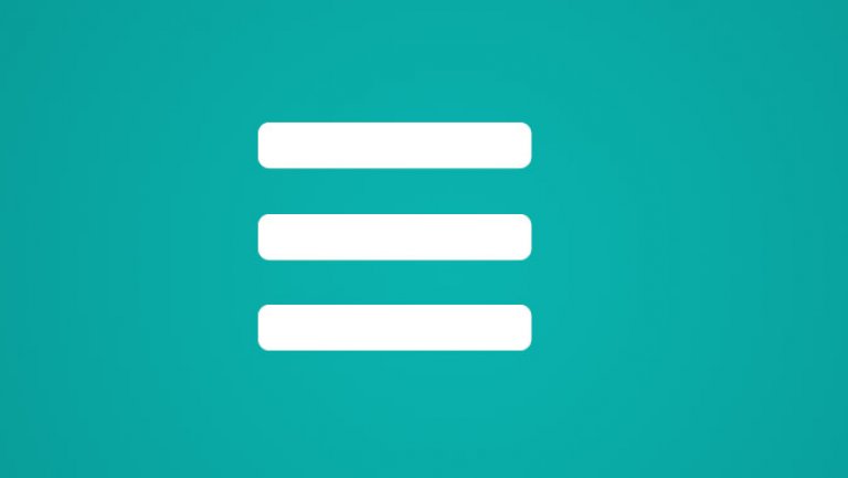
Usability testing responsive sites has led to some interesting observations of how people understand certain icons. Here we take a look at how users react to the infamous nav burger.