Process for delivering designs that help manage expectations and providing the foundation for theming.
Design Deliverables & Best Practices
Thursday, 16th May, 2013
“Ideas usually fail not because they're bad ideas, but because they're badly presented”[1] is an ethos that rings true across the whole of the web design process, from the initial presentation to a client right up until the moment it gets final approval for development. If you allow yourself to be too vague when showing or explaining work then people will immediately try to fill in the blanks with their own ideas, with no guarantee that they’ll come up with the same conclusions you intended.
Filling in these blanks ahead of time is key to ensuring that the approved design work matches the final live site; not just for a designer who wants to see their work realised, but for the client who wants the product they’re paying for to match the one they signed off on.
Whilst freelancers and smaller studios may have the luxury (or compromise, depending on your opinion) of having a designer who also works as a coder, larger agencies may have a team of designers who aren’t always in constant contact with the developers. Whilst it’s sometimes an unavoidable arrangement, it does mean that it’s worth the effort to fill in these aforementioned blanks when it comes to handing over any design work. This need increases exponentially as a team becomes larger and includes more and more people at varying levels of involvement.
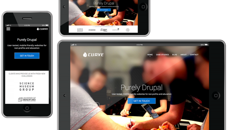
With fluid, responsive designs becoming more and more pervasive this idea of having one person to design your site and one person to code it is becoming blurred; tools like Adobe’s Edge Reflow[2] allow the designer to quickly create mockups and showcase ideas with live code. Responsive designs looks to place less emphasis on a single design for each screen size (most commonly: desktop, mobile and tablet) and more on ‘modules’ that can be reused and rearranged. This only increases the need for clear explanations surrounding each module, it’s implementation and interactions.
Frameworks and GUI kits like Bootstrap and Flat UI (or Almost Flat UI, if you’re looking for something in between the two) go to great lengths to explain how each individual element of the design works, the interactions involved and how best to use it in your own work. Fitting these LEGO-like building blocks together then allows you to create a unified piece of design that works at multiple screen sizes. This goes against the prescribed tradition of creating each page as a whole in something like Adobe Fireworks or Photoshop and handing this over to a developer to be coded.
However I think there is definitely still something to be said for such an approach. This idea of breaking all design work down into modules makes it difficult to understand how the site will look as a whole. Whilst there’s only so much a flat .jpg file can tell you about how a site will look across multiple devices and screen sizes, pulling these together into a traditional page composition gives the best indicator - especially to any client - of how their finished product will look. Anything that can make the design and development process faster - and smoother - should be considered a good thing.
The team at Treehouse wrote back in 2007 on the idea of creating a DDD (Design Description Document) for each project; essentially a series of slides that lays out each page of a given site, outlining the interactions and intentions of it as well as leaving space for any additional notes for aiding developers and other project investors. Whilst this idea was mooted at a time when responsive design was in its infancy (this article from the BBC has interesting screenshots of how such a large organisation approached mobile web design just 6 years ago) I think it’s still relevant today, striking a balance between the more modular nature of responsive design and the more traditional one-design-per-page approach. By creating a document that serves designers, developers, project managers and clients, any ambiguity in the designs and user experienced is reduced.
However when it comes to the nitty gritty of what to create in terms of design deliverables that should accompany any handover, there are core items that remain unchanged:
- Graphics and layout files: If you’re using software such as Adobe Fireworks or Photoshop, making sure the original editable files are readily available can be a huge help to a developer looking to understand how a particular part of a design has been created. Whilst serving them up as ‘flat’ non-editable files can be adequate, having the originals on hand with correctly named groups and layers can be invaluable.
- Fonts and typefaces: Services such as Google Web Fonts have made this less important in recent years, but making sure any custom fonts that you’ve used are included with your designs in order to make sure that they get translated directly during development.
- Grid system: If you’re familiar with responsive design work or only just starting out, it’s important to make a note of the grid systems being used so that any designs - and the content contained within them - is setup properly. SprySoft’s Variable Grid System allows you to quickly and easily create these and even grab a CSS file that you can carry straight into the development phase.
- High-resolution images, logos, brand guidelines: Oft forgotten but always-helpful assets to help a site look it’s best - especially if you’re targeting high-resolution ‘Retina’ screens.
Web design as an industry is constantly evolving and so it’s likely that the requirements expected for a fully responsive design will change rapidly over the next few years. However this article should represented a strong baseline on which you can build your own work for both personal and client projects.
Check out our latest blog article about Adobe's responsive design tool #Reflow http://t.co/idadoP9ErC
— Curve Agency (@CurveAgency) April 5, 2013
Share your thoughts on deliverables for responsive design in the comments below.

User Interface Designer
Simon is a digital interface designer based in Leeds, he works across both print design and webdesign.
Related Articles
Thursday, 31st July, 2014
Danny explains how to use the handy Adaptive Image Drupal module to create device-appropiate images on your site.
Thursday, 26th June, 2014
Is the infamous nav burger menu icon ultimately doomed? Thoughts on possible alternatives, for a truly mobile first approach.